2022 Week 49 | Power BI: Build a Holiday Song Picker
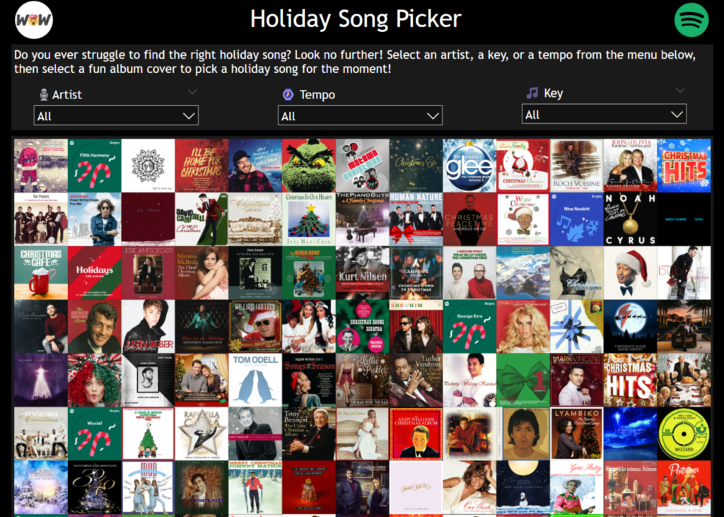
Introduction Welcome back to Workout Wednesday 2022! This week we’re continuing our work with images and building a fun Holiday Song Picker using the Image Grid custom visual in Power BI! We’ll use data from Spotify to help select a song based on Artist, Tempo, or Key. If you’d like to follow along with the […]
2022 Week 49 | Power BI: Build a Holiday Song Picker Read More »
Power BI, Workout Wednesday