2023 Week 50: Can you build this simple KPI?
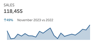
Introduction This is the most common chart I made in Tableau so I thought it would be fitting to share with all of you. Enjoy! Click to open in Tableau Public Requirements Dashboard size: 400 x 200 1 worksheet Show the sales from the most recent full month. Show the percent change from the same month […]
2023 Week 50: Can you build this simple KPI? Read More »
Tableau, Workout Wednesday