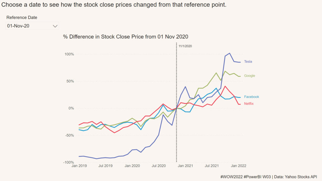
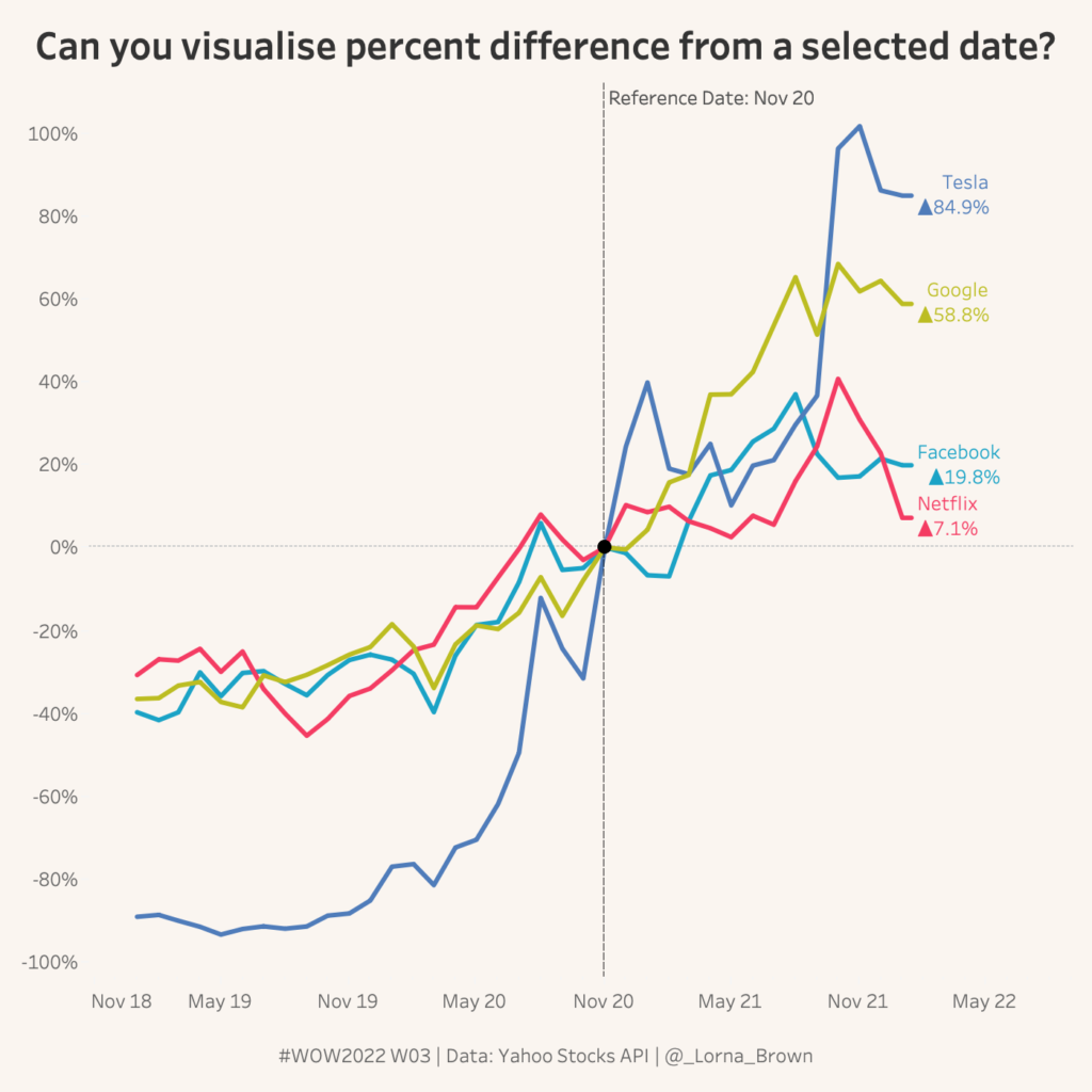
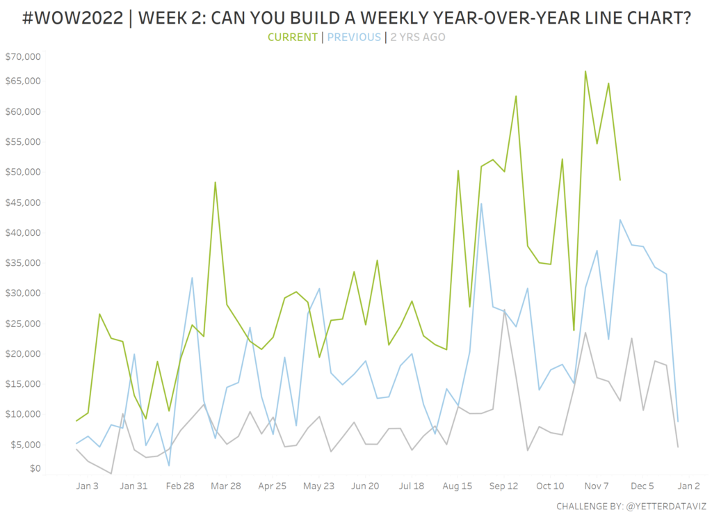
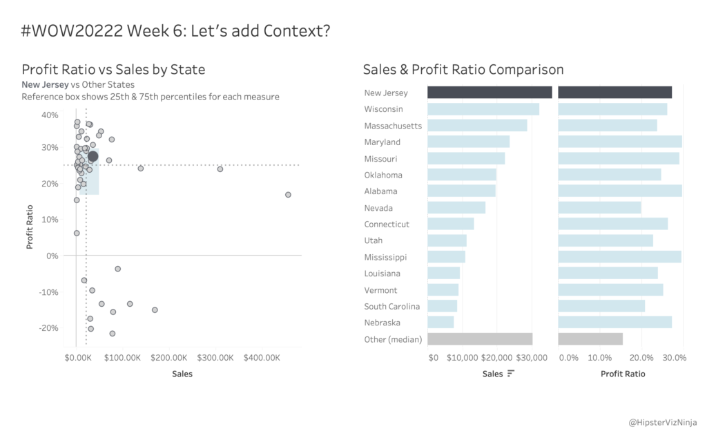
Workout Wednesday

Week 05 2022 Challenge

2022 Week 05 | Power BI: Can you make a Nested Chart with Charticulator?

Introduction This week we are familiarising ourselves with Charticulator and Nested Charts. This graph was inspired by Gus Wezerek and Sara Chodosh’s chart for NYT Opinion. Requirements Download the data and remove all columns excepting the Date field, New Cases Smoothed Field and Location (save as csv) Create a second csv with only Location = …

2022 Week 05 | Power BI: Can you make a Nested Chart with Charticulator? Read More

Scatter Chart

#WOW2022 | Week 05 | Can you build a reference box?

Introduction This week is my debut challenge as a Workout Wednesday coach and it’s safe to say that I’m looking forward to the year ahead! All the coaches are teaming up this month to bring together an interactive dashboard made up of challenging charts. Over the next few weeks, each coach will contribute one piece …

#WOW2022 | Week 05 | Can you build a reference box? Read More

2022 – Week 4: How have successful products performed?

Introduction This week’s challenge looks at products in Tableau’s superstore dataset. In this challenge you will have to find the products that have been profitable in each of the four years in this dataset. That means profitable in 2018, 2019, 2020, and 2021.  Once you have identified successful products (the consistently profitable products) then you …

2022 – Week 4: How have successful products performed? Read More

Line chart with vertical reference line

2022 Week 03 | Power BI: Can you visualize percent difference from a selected date?

Introduction This week we are taking a page from the Tableau team and looking at how a metric has changed from the value at a specified reference date.  Requirements Create a line chart showing percent change of the close price from a selected date.  Use a slicer or other visual to allow users to change …

2022 Week 03 | Power BI: Can you visualize percent difference from a selected date? Read More

#WOW2022 | Week 03 | Can you visualise percent difference from a selected date?

Introduction I can’t believe I am entering my 4th year as a Workout Wednesday coach. It has been such an incredible journey so far. I bet you think how do we come up with the challenges all the time? Tableau has such a broad range of calculations and different ways of doing things so that …

#WOW2022 | Week 03 | Can you visualise percent difference from a selected date? Read More

WOW2022 Week 2: Can you build a weekly Year-over-Year line chart?

Introduction I’m excited to join the Workout Wednesday coaching team this year! For my first challenge, I’m pulling from some recent work experience. Our leadership team wanted to see weekly performance for the week ending Sunday, with the current and prior 2 years in the chart. We also needed to include the YoY% change, and …

WOW2022 Week 2: Can you build a weekly Year-over-Year line chart? Read More

2022 Week 02 | Power BI: Simplified Custom Page Navigation

Introduction Welcome back to Power BI #WorkoutWednesday – week 2! We had incredible participation last week and are so excited to dive in this week with custom page navigation. If this sounds familiar, it’s because we did a similar navigation challenge back in November 2021. In a fortunate turn of events, the Power BI team …

2022 Week 02 | Power BI: Simplified Custom Page Navigation Read More

2022 Week 01 | Power BI: Sparklines!

Introduction Welcome back to another year of Power BI #WorkoutWednesday! We hope you enjoy the challenges that we are going to present you this year. To get this year started off right, this week’s challenge will be introducing you to a feature that was released in the December 2021 Power BI Desktop release, sparklines. I’ve …

2022 Week 01 | Power BI: Sparklines! Read More

Scroll to Top