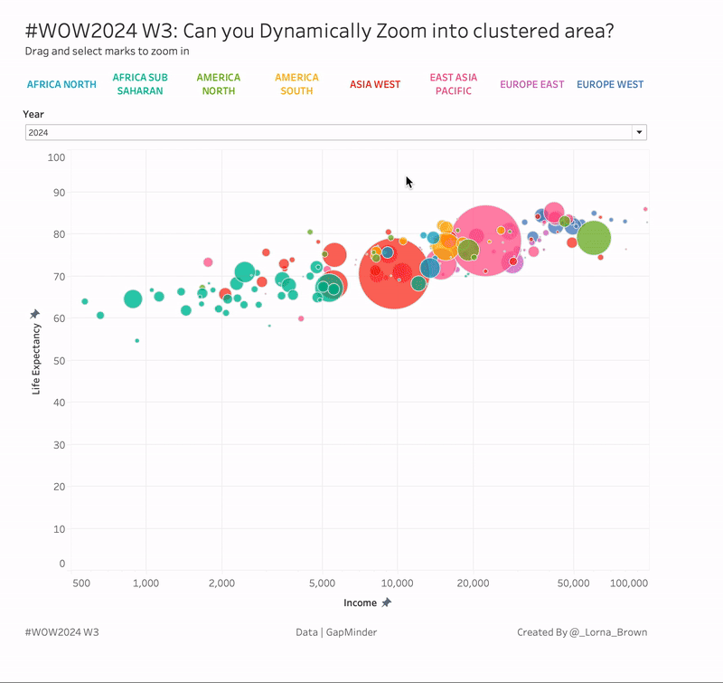
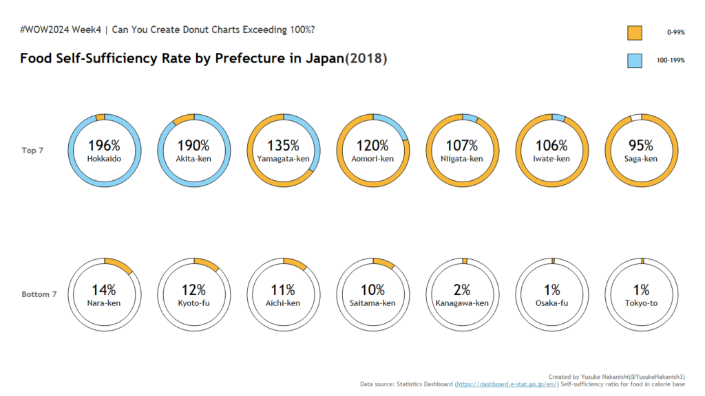
Workout Wednesday

Jittered Scatter Chart and Bubble Plot of Adelaide rainfall between 1183 and 2022

2023 Week 22 | Power BI: Inverted Jittered Scatter

Introduction This week’s challenge uses Deneb custom visual to create a jittered scatter with inverted axis plus a bubble plot with labels. Requirements Power Query Obtain the dataset from Australian Bureau of Meteorology Website Model and load data Power BI Desktop Option 1: Obtain Deneb Custom Visual from AppSource Create a Scatter Chart with point …

2023 Week 22 | Power BI: Inverted Jittered Scatter Read More »

Sample Power BI report

2023 Week 21 | Power BI: Create a Theme – With a Twist!

Introduction This week, we’re building on Shannon’s theme from Week 17 2022 by creating a custom Power BI theme–with a twist!   Instead of manually selecting colors, this week you’ll use OpenAI’s free version of ChatGPT (or your Large Language Model (LLM) of choice) to create a theme. You’re in control of your prompts, and …

2023 Week 21 | Power BI: Create a Theme – With a Twist! Read More »

#WOW2023 | Week 21 | Profit vs Target (with Tolerance)

Introduction This week’s challenge is a slight twist on the classic Measure (bar) vs Target (gantt) chart. The key difference here is that we want to allow the user to select a ‘tolerance’ around the specific Target value. We only want to highlight months where profit was Above or Below the permited tolerance. Click to …

#WOW2023 | Week 21 | Profit vs Target (with Tolerance) Read More »

baseball length column chart

2023 Week 20 | Power BI: Remake of Tableau Length of Baseball Games

Introduction For this Workout Wednesday, we are putting a Power BI spin on a Tableau viz created by Luke Stanke and Spencer Bauke for their Workout Wednesday 2023 Week 14.  While we could probably match nearly exactly to the original Tableau viz by using Deneb in Power BI, I wanted to see what I could …

2023 Week 20 | Power BI: Remake of Tableau Length of Baseball Games Read More »

2023 Week 20: Can you build a heat map with bathymetry lines?

Introduction This week, I’m introducing the idea of taking bathymetry or contour lines on maps and placing the lines on heat maps. These lines come from identifying the elevation (for contour lines) or depth of water (for bathymetry lines) and creating a map using those values. Here is an example of a contour map from …

2023 Week 20: Can you build a heat map with bathymetry lines? Read More »

2023 Week 19 | Power BI: Formatted bar chart and bookmark navigator

Introduction Welcome back to Workout Wednesday! We’re taking inspiration once again from our friends at Makeover Monday. This one is fun – the Makeover Monday team was inspired by a bar chart featured in a blog post and they decided to recreate it in Tableau! You can read Andy’s full post on his blog if you want more info.  Today …

2023 Week 19 | Power BI: Formatted bar chart and bookmark navigator Read More »