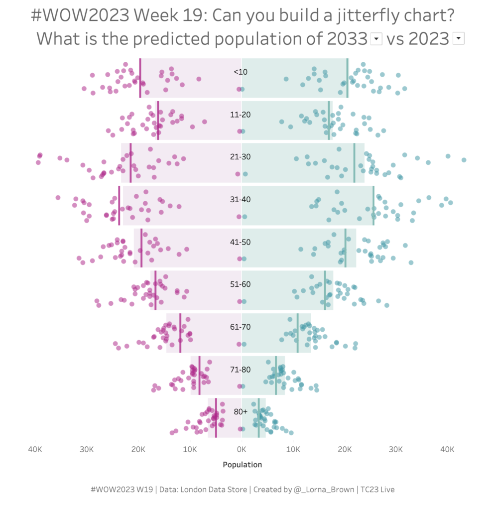
Workout Wednesday

2022 Week 31 | Power BI: Connected Scatter with PlotlyJS

Introduction This week for Workout Wednesday we are getting familiar with the PlotlyJS visual by creating traces and annotations for a connected scatterplot.   Connected scatterplots are a cross between a scatterplot and a lineplot whereby two numeric variables are connected by a third ordered variable (often time).   The below graph created with the …

2022 Week 31 | Power BI: Connected Scatter with PlotlyJS Read More »

2022 – Week 29: What is the Time-Weighted Return?

Introduction Working with financial data is hard. There are some calculations that make for long evenings to get right. One of those calculations is Time-Weighted Return. This challenge is simple: calculate the Time-Weighted Return Rate for a simple data source and return a line chart. Click to open in Tableau Public Requirements Dashboard Size: 400px …

2022 – Week 29: What is the Time-Weighted Return? Read More »

2022 Week 27 | Power BI: Navigating Hierarchies

Introduction If you weren’t aware, June was Music Month and Kerry Kolosko gave us a brilliant visualization of Beatles tunes using Charticulator – you can check out the challenge here.    This week we are going to be recreating a recent Tableau challenge from Sean Miller that was featured in Week 11 of this year’s Tableau …

2022 Week 27 | Power BI: Navigating Hierarchies Read More »