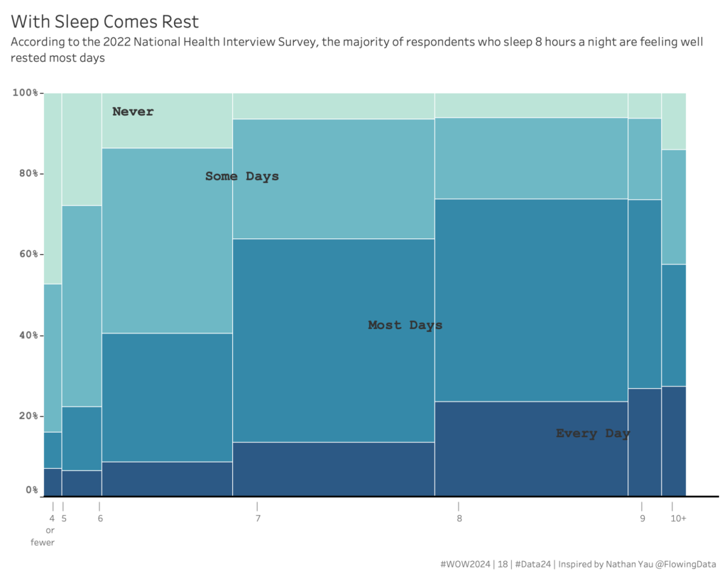
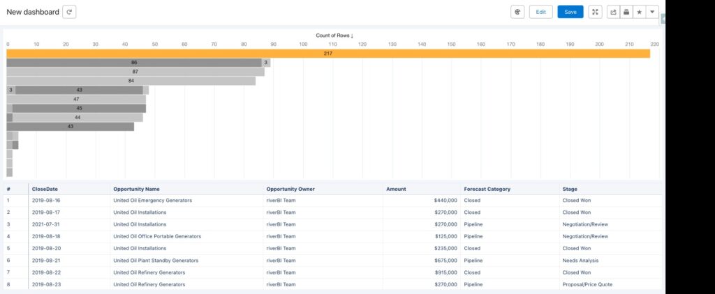
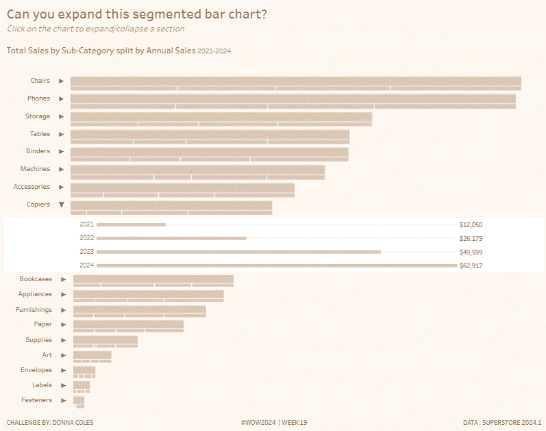
Year: 2024

Faceted Strip Plot with Median Overlay

2024 Week 5 | Power BI: Create a Strip Plot with Median Overlay

Introduction Sometimes it can be useful to show all data points instead of aggregating them. That is where an instance chart, also called a strip plot or a barcode plot, can be useful. This week we are building on a faceted strip plot made in 2023 week 35, and adding a median overlay. Inspired by …

2024 Week 5 | Power BI: Create a Strip Plot with Median Overlay Read More

2024 Week 5 | Sigma: Can you use dynamic text to report on KPIs?

Introduction Welcome to Week Five 🖐🏼 This week’s challenge is all about crafting an impactful headline. Whether it’s for the top of a dashboard or a key component of a presentation, the goal is to effectively highlight KPI performance of email campaigns through Hubspot. We’ll be utilizing Sigma’s dynamic text feature, drawing data directly from …

2024 Week 5 | Sigma: Can you use dynamic text to report on KPIs? Read More

#WOW2024 | Week 5 | Excel at Tableau Interactivity with Dynamic Zone Visibility

Introduction It’s a pleasure to be back for my third year on the Workout Wednesday team. This week, I wanted to create a challenge that incorporates one of the things that will elevate many visualizations, which is seamless and intuitive interactivty. A good user experience should, by design, appear simple but often involves careful consideration …

#WOW2024 | Week 5 | Excel at Tableau Interactivity with Dynamic Zone Visibility Read More

2024 Week 4 | Sigma: Can you recreate this KPI Chart?

Introduction Welcome to Week Four! This week, we’re going to create a single element that shows multiple pieces for analysis. This challenge is easier than last week, and is meant to show how quickly Sigma can perform period over period analysis on any KPI.  Good Luck!-Ashley Need access to Sigma? Click Here to Sign Up …

2024 Week 4 | Sigma: Can you recreate this KPI Chart? Read More

2024 Week 4 | Power BI: Recreate this weather visual with overlapping columns

Introduction I keep seeing a particular visual shared by a Denver-area meteorologist on social media. It seems to be output from weathermodels.com.  I thought it might be fun to make a modified version in Power BI, so that is our challenge this week. While we don’t have native overlapping columns, there is a native solution …

2024 Week 4 | Power BI: Recreate this weather visual with overlapping columns Read More

#WOW2024 | Week 4 | Can You Create Donut Charts Exceeding 100%?

Introduction I am honored to join as a new contributor starting from 2024. I have gained immense skills and motivation from the Tableau community, including Workout Wednesday.As a way to give back to the community, I am committed to providing valuable and enjoyable challenges! Now, let me introduce a challenge about donut charts that I …

#WOW2024 | Week 4 | Can You Create Donut Charts Exceeding 100%? Read More

2024 Week 3 | Power BI: Back to basics with a bar chart

Introduction Welcome back to Workout Wednesday! We’re taking it back to basics this week and creating a bar chart that uses small multiples and conditional formatting. We’re using the #MakeoverMonday team’s data on New Year’s Resolutions and the design is inspired by a Makeover Monday participant! A huge thank you to Ela Piwowarska for creating her submission and …

2024 Week 3 | Power BI: Back to basics with a bar chart Read More

Scroll to Top