2023 Week 13 | Power BI: Create a connected scatterplot with image markers

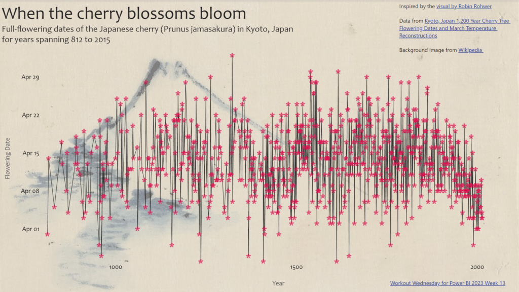
Introduction This week we are getting a bit artistic and taking inspiration from a visual that was recently published by Robin Rohwer on Twitter. She created a connected scatterplot that uses a flower emoji to represent each point. I thought her visual was wonderful, so I set out to create something like it in Power …

2023 Week 13 | Power BI: Create a connected scatterplot with image markers Read More »

#WOW2023 | Week 12 | Can you build a dashboard using containers?

Introduction A few weeks ago I saw this Twitter poll (and the ensuing discussion) about Team Tiled vs Team Floating and I noted that I am neither. Rather, I am Team Container. Using Containers in dashboards makes positioning and sizing everything in your dashboard a piece of cake, once you have mastered how they work. …

#WOW2023 | Week 12 | Can you build a dashboard using containers? Read More »

Image of Power BI report.

2023 Week 12 | Power BI: Are your reports accessible?

Introduction Welcome back to Workout Wednesday! This week we’re taking a note out of Meagan’s book and looking at existing reports to ensure they’re accessible to our end-users.  Creating accessible Power BI reports isn’t just a nice-to-have feature, but a crucial aspect for ensuring all users can access and understand your data. Don’t let accessibility …

2023 Week 12 | Power BI: Are your reports accessible? Read More »