2022 Week 25 | Power BI: Visualizing Music
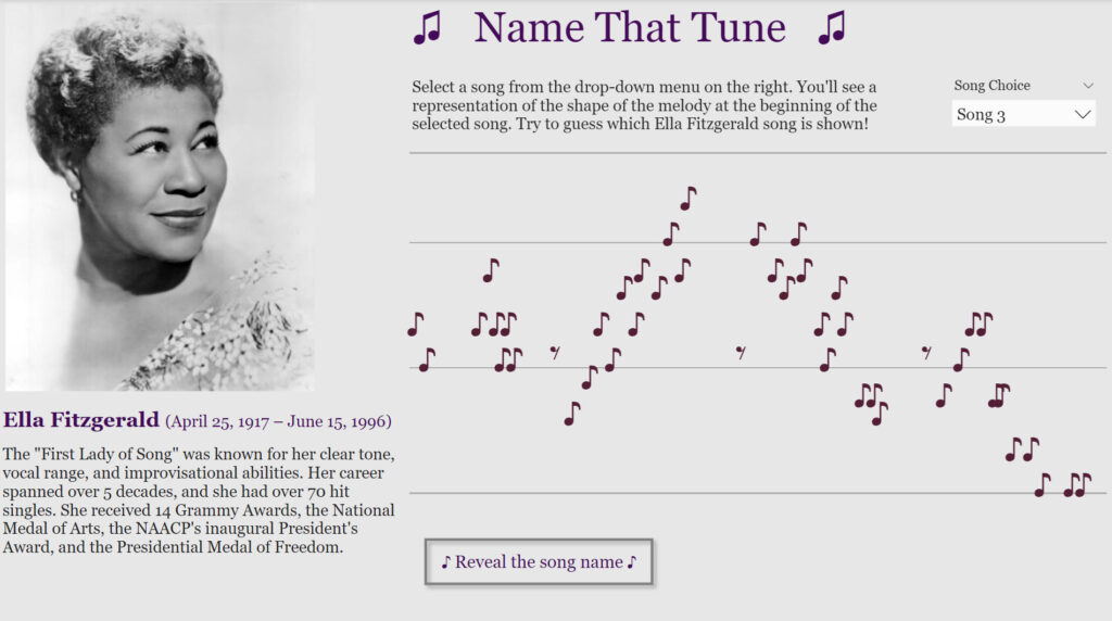
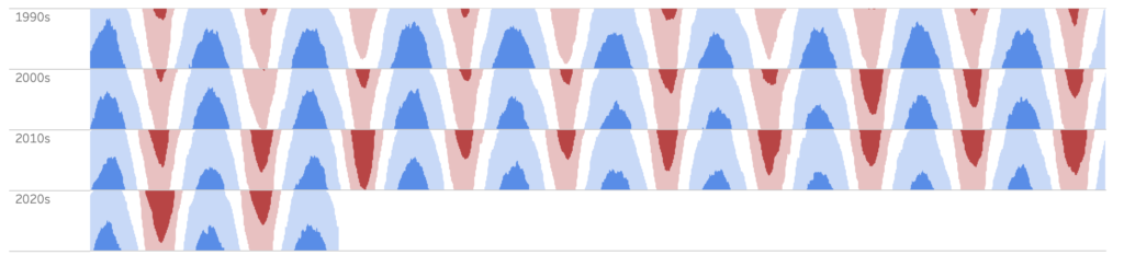
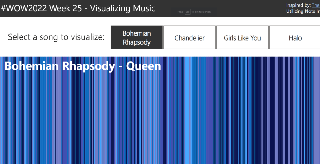
Introduction June is still music month, so for this week’s challenge we’re going to visualize music. Sometimes the simple visualizations tell the best stories. That is definitely the case for the “warming stripes” visualization which was used to show the change of global temperature over time. Using this as motivation, what if we created a …