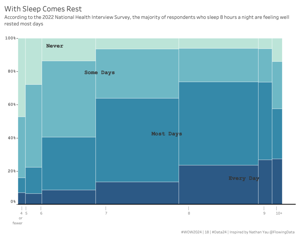
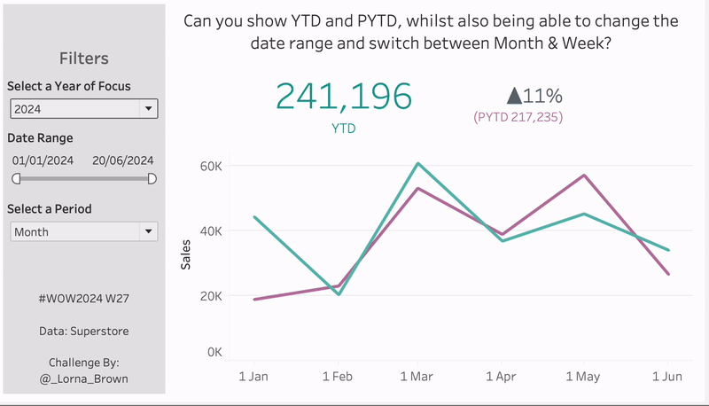
Tableau

Scatterplot of profit on Y Axis and sales on X Axis, with a dot for each state, colored by profit ratio.

WOW2023 Week 30: Can you build a dynamic drill down scatterplot in one view?

Introduction We’re continuing retro month this week, and I decided to re-viz Andy’s Week 41 challenge from 2017. I chose this one because I really like the concept of being able to drill down from state into city on the same chart, but I wondered if things would be easier than the calculations required to …

WOW2023 Week 30: Can you build a dynamic drill down scatterplot in one view? Read More

#WOW2023 Week 25: Can you calculate a percent difference between a range of dates?

Introduction I saw this visualisation floating around my twitter and trending on Tableau Public and thought it would make a great challenge for Workout Wednesday. Big thanks to Jacob for letting me use his visualisation as inspiration today! In this weeks workout, I want you to look at the percent change between two dates, we …

#WOW2023 Week 25: Can you calculate a percent difference between a range of dates? Read More

#WOW2023 Week 24 | Can you build a mobile KPI app?

Introduction This week’s challenge is another exploration of dynamic zone visibility, this time combined with a mobile app-like concept. Sometimes executives need just a few critical metrics at their fingertips, and this is a concept I’ve mulled around for a while (probably stemming from this concept by Anya A’Hearn) but felt like dynamic zone visibility …

#WOW2023 Week 24 | Can you build a mobile KPI app? Read More

#WOW2023 | Week 21 | Profit vs Target (with Tolerance)

Introduction This week’s challenge is a slight twist on the classic Measure (bar) vs Target (gantt) chart. The key difference here is that we want to allow the user to select a ‘tolerance’ around the specific Target value. We only want to highlight months where profit was Above or Below the permited tolerance. Click to …

#WOW2023 | Week 21 | Profit vs Target (with Tolerance) Read More

Scroll to Top