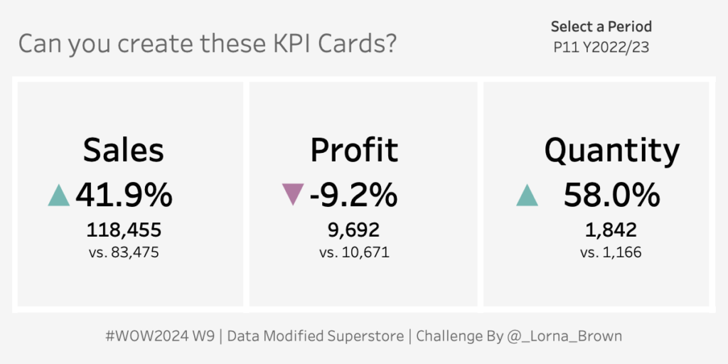
#WOW2023 week 10: Let’s practice Device Designer
One of the less often used features of Tableau is device designer. While it may not be needed all the time, when the need does arise its good to have the practice under your belt
Introduction This week’s challenge was inspired by a question from a client. In truth, I was not able to solve the problem for them upfront. This challenge would not exist were it not for an article in the Tableau Community that explains how to achieve the desired outcome – thanks to whoever wrote this up! …
Introduction The theme for February 2023 has been alternatives. This week I present an alternative (and trust me, there are many other alternatives) to my least favorite chart: the side-by-side bar chart. The reason this chart is so difficult for me is because it takes up a lot of space and when I am doing …
2023 Week 8: Can you build a comet chart as an alternative to a side-by-side bar chart? Read More
NPS Survey data can be tricky to wrangle and work with. Check out this week’s Tableau #WorkoutWednesday and see if you can do it!
Introduction As Donna mentioned last week, this month we’re focusing on alternative chart types. This jitterplot is a fun one inspired by one of Steve Wexler‘s charts in The Big Book of Dashboards. I like jitterplots because they allow you to easily see how an individual compares to the rest of the group via distribution, …
#WOW2023 | Week 6 | Can you create a normalized jitterplot? Read More
Introduction Hi everybody. It’s now my turn to set my first challenge as part of the official #WOW crew – eeek!. For those of you who don’t know me, I’ve been completing these challenges since the program was launched in 2017, and I blog solution guides on my personal blog at https://donnacoles.home.blog/. I’ve been approached …
NPS Survey data can be tricky to wrangle and work with. Check out this week’s Tableau #WorkoutWednesday and see if you can do it!
Introduction This week’s challenge is one I’ve been waiting to share with you. It has a bit of everything, so I hope you enjoy it! The goal is to visualize the Sales in a given year for different countries in Europe, with an indicator in the tooltip to identify whether this value has increased or …
#WOW2023 | Week 3 | Calculating Year-On-Year Percentage Change Read More
Introduction Can you believe it’s 2023 already? No me neither, but we have a cracking line up for this year that makes me excited to still be apart of the Workout Wednesday Team. If this is your first time here, Welcome to #WOW2023. The aim of this community initiative is to rebuild the visualisation using a …
#WOW2023 Week 1: Can you use Image Role & Dynamic Zone Visibility? Read More
Introduction What a year 2022 has been! For the last challenge of 2022 we’ll build some waffle charts showing % of sales by segment. Even though I knew the general principle of waffle charts, it was some good practice for me making this one. Hopefully it’ll be some helpful practice for you all as well. …
#WOW2022 | Week 52 | Can you create a waffle chart? Read More