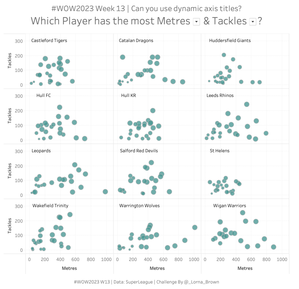
#WOW2023 | Week 4: Can you visualize survey data?
NPS Survey data can be tricky to wrangle and work with. Check out this week’s Tableau #WorkoutWednesday and see if you can do it!
Introduction This week’s challenge is one I’ve been waiting to share with you. It has a bit of everything, so I hope you enjoy it! The goal is to visualize the Sales in a given year for different countries in Europe, with an indicator in the tooltip to identify whether this value has increased or …
#WOW2023 | Week 3 | Calculating Year-On-Year Percentage Change Read More
Introduction Can you believe it’s 2023 already? No me neither, but we have a cracking line up for this year that makes me excited to still be apart of the Workout Wednesday Team. If this is your first time here, Welcome to #WOW2023. The aim of this community initiative is to rebuild the visualisation using a …
#WOW2023 Week 1: Can you use Image Role & Dynamic Zone Visibility? Read More
Introduction What a year 2022 has been! For the last challenge of 2022 we’ll build some waffle charts showing % of sales by segment. Even though I knew the general principle of waffle charts, it was some good practice for me making this one. Hopefully it’ll be some helpful practice for you all as well. …
#WOW2022 | Week 52 | Can you create a waffle chart? Read More
Introduction I recently had this type of request at work – stop me if you’ve heard this before. We need to show the trend of [single or multiple measures] and we want to see it by these specific dimensions. Oh! And we also need to be able to filter by the same dimensions as well… …
#WOW2022 Week 51: Let’s show quarterly sales with end-user flexibility Read More
Introduction This is my last challenge of the year and what better way to round things off than with everyone’s favourite chart – the bar chart – but let’s make it “sexy”. Bar charts may be simple but when you combine them with some interactive highlighting and sorting you can create something quite dynamic which …
#WOW2022 | Week 50 | Interactive Proportional Brushing Read More
Introduction This challenge you are to recreate a pie chart with some interesting formatting. Click to open in Tableau Public Requirements Use Segment and Sales to divide the pie slices. Have a thin solid exterior with Segment labels on the outside. Have white space between the edge and the interior of the pie. Have a …
Introduction This week we have an early release due to doing a live session at VizIt London. For this week I wanted to focus on the new feature, Dynamic Zone Visibility and I have taken inspiration from an old WOW from Ann in 2018. See older challenge here Click to open in Tableau Public Requirements …
Introduction Small multiples can be a good way to see overall trends across several categories, but sometimes it can be tricky to get the sorting and labels right, so that’s what we’ll practice this week! Since baseball season is over now, we’ll look at overall win percentage from 1998 to 2022 for Major League Baseball …
#WOW2022 | Week 47 | Can you label and sort small multiples? Read More
Introduction Man, sometimes the #datafam is just so very inspiring. I recently saw this tweet by Visionary, Klaus Schulte, this week and immediately knew I wanted to make a challenge out of it. The premise is quite simple – make a tile map but also add the state outline to further assist readers to where …