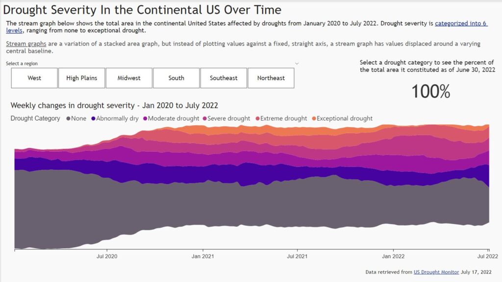
Workout Wednesday

#WOW2022 W28: Can you build a butterfly chart?

Introduction This week my challenge comes from two places of inspiration. Firstly the ONS website and secondly a final interview for someone applying to the Data School. I loved the concept of the chart and it helps with context and also synchronisation of axis. Have fun. Click to open in Tableau Public Requirements Dashboard Size: 800 …

#WOW2022 W28: Can you build a butterfly chart? Read More

2022 Week 28 | Power BI: Error Bars

Introduction Welcome back to Workout Wednesday! If you’re joining us for the first time, welcome! We present you with a challenge, a dataset to recreate the challenge, and a solution video or file. You can use these challenges to build your skills and your portfolio! This week we’re exploring the error bars feature in Power …

2022 Week 28 | Power BI: Error Bars Read More

#WOW2022 Week 27: Can you make a bullet chart?

Introduction This week’s challenge is inspired by one of the dashboards in The Big Book of Dashboards, by Steve Wexler, Jeffrey Shaffer, and Andy Cotgreave. If you’re not familiar with it, the BBOD is a tremendous resource of tools and concepts you can apply to real world business scenarios, and you can learn more at …

#WOW2022 Week 27: Can you make a bullet chart? Read More

2022 Week 27 | Power BI: Navigating Hierarchies

Introduction If you weren’t aware, June was Music Month and Kerry Kolosko gave us a brilliant visualization of Beatles tunes using Charticulator – you can check out the challenge here.    This week we are going to be recreating a recent Tableau challenge from Sean Miller that was featured in Week 11 of this year’s Tableau …

2022 Week 27 | Power BI: Navigating Hierarchies Read More

#WOW2022 | 26 | Let’s make a dynamic relative filter

Introduction Welcome to week 26 – the halfway mark of 2022! This week is pretty straightforward; how simple it will be is up to you 😀 I’ve always really liked using the relative date filter in Tableau but one thing that’s always irked me is that the anchor date is not dynamic – neither end-user …

#WOW2022 | 26 | Let’s make a dynamic relative filter Read More

2022 Week 26 | Power BI: Polar Plots with Charticulator

Introduction June is Music Month and this week we are getting arty with Charticulator. In our previous Charticulator challenges, we designed with cartesian plots, spiral plots and tried our hand at nested charts. For this challenge we use a Polar Scaffold to visualise songs segments by time/duration.   This challenge presumes some Power Query experience. …

2022 Week 26 | Power BI: Polar Plots with Charticulator Read More

#WOW2022 | Week 25 | Double drill-down with Set Actions

Introduction My second favourite challenge in Tableau, after Table Calculations, is anything with Set Actions. Some of you may have already used these in previous challenges this year, but this week I am dedicating it to this wonderful (and sometimes tricky) Tableau functionality. Warning: this is not a beginner-friendly challenge! The problem I wanted to …

#WOW2022 | Week 25 | Double drill-down with Set Actions Read More

2022 Week 25 | Power BI: Visualizing Music

Introduction June is still music month, so for this week’s challenge we’re going to visualize music. Sometimes the simple visualizations tell the best stories. That is definitely the case for the “warming stripes” visualization which was used to show the change of global temperature over time. Using this as motivation, what if we created a …

2022 Week 25 | Power BI: Visualizing Music Read More

2022 Week 24 | Scatterplot with custom marker

Introduction For this workout, we are visualizing data in a scatterplot in a bit of a non-traditional manner. This week marks 26 years since Ella Fitzgerald, the “Queen of Jazz”, passed away. So we are visualizing melodies to a few of her songs. My approach is a bit abstract – not quite sheet music but …

2022 Week 24 | Scatterplot with custom marker Read More

Scroll to Top