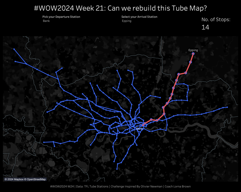
2024 Week 21 | Sigma: Can you set some boundaries?
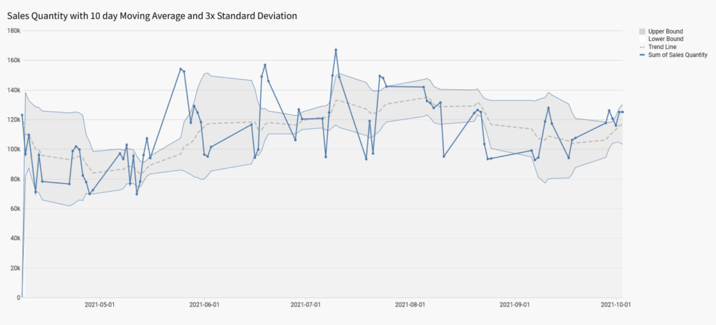
Introduction This week, I was inspired by a post in the Sigma Community from Mark Ruesink that showed a really clever way to visualize outliers in Sigma using a combo chart and some clever calculations. Mark goes all the way to visualizing outliers, so I definitely recommend checking out his full post, but I wanted […]
2024 Week 21 | Sigma: Can you set some boundaries? Read More »