Month: March 2022

Power BI Report containing Demeb bullet charts

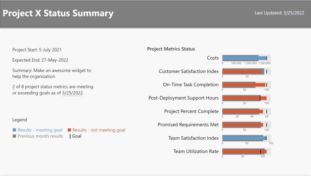
2022 Week 13 | Power BI: Build a Bullet Chart with Deneb

Introduction For this last week of March, we are continuing our project management theme.  The challenge this week is to use Deneb to build bullet charts using the provided data. Bullet charts were created by Stephen Few to offer an alternative to clunky gauges. Bullet charts are used to compare a featured measure to one or …

2022 Week 13 | Power BI: Build a Bullet Chart with Deneb Read More

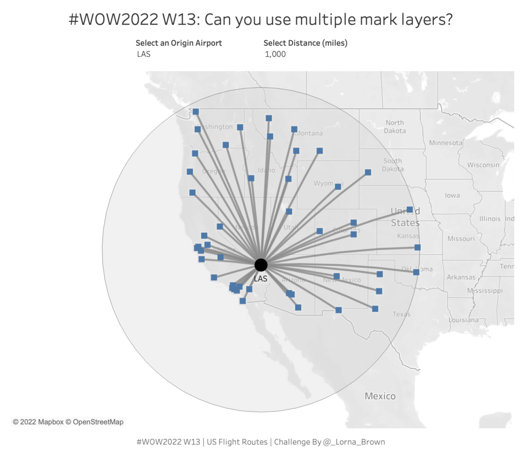
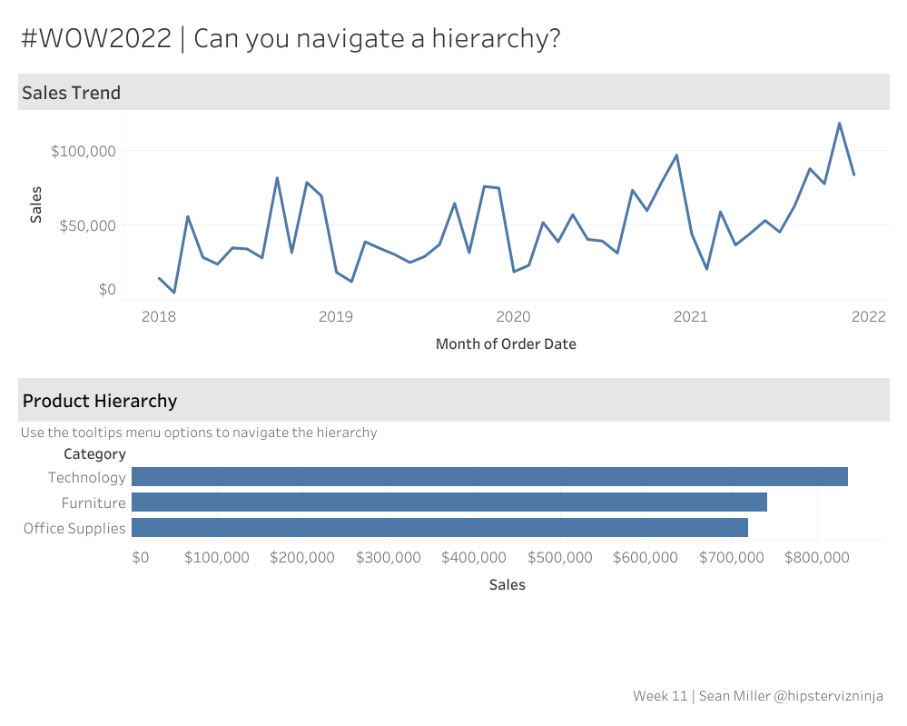
#WOW2022 W13: Can you use multiple Mark Layers?

Introduction This week I hone in on majority of those spatial calculations within Tableau. I love the flexibility that Mark Layers allows us to have. Prior to Tableau 2020.4 maps could only have 2 layers and creating this hub and spoke style map would require some serious data preparation. This workout requires 6 calculations.  Click …

#WOW2022 W13: Can you use multiple Mark Layers? Read More

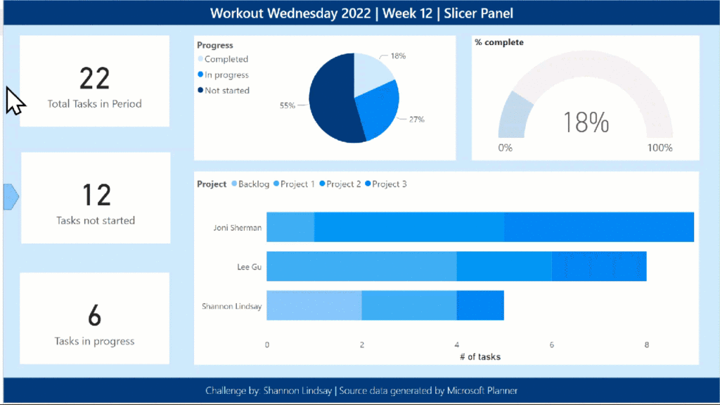
2022 Week 12 | Power BI: Build a Slicer Panel

Introduction Welcome back to Workout Wednesday – we’re glad you’re here! This week, we’re continuing on with our project management theme. We’re tracking project progress using data generated from Microsoft Planner. Using Power BI with Planner (as opposed to using the inbuilt charts) enables us to both customize visuals and to view more than one plan at …

2022 Week 12 | Power BI: Build a Slicer Panel Read More

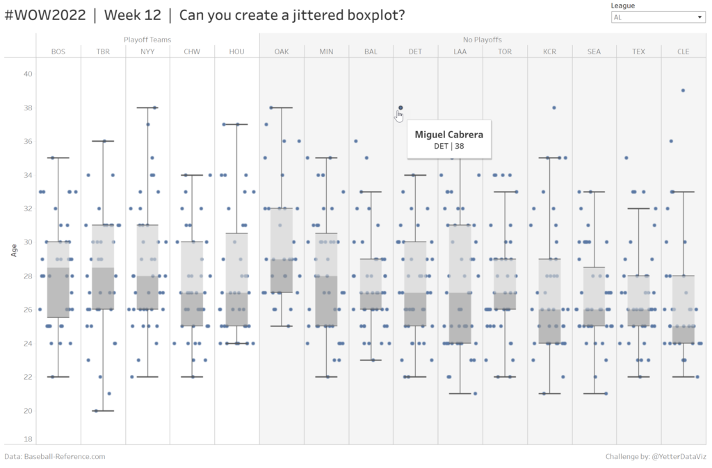
Jittered boxplot showing age distribution for MLB teams in 2021

2022 Week 12: Can you create a jittered boxplot?

Introduction Last week a colleague reached out for help creating a boxplot to look at age distribution for different subscription methods, and my first thought was, “I know how to do that, but I don’t remember how to do that.” So I went back to find one I had made previously, and we were able to …

2022 Week 12: Can you create a jittered boxplot? Read More

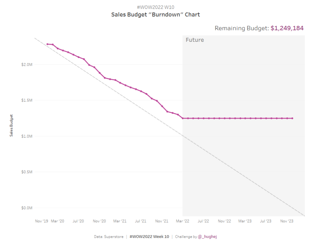
2022 Week 11 | Power BI: Project Budget Tracker

Introduction Your challenge this week is to create a Project Budget Tracker leveraging the IT Spend Analysis example dataset available to everyone in Power BI Service.  We decided to keep the project management theme going this week with this take on tracking how your project is following the budget.  If you did not do last week’s challenge, I …

2022 Week 11 | Power BI: Project Budget Tracker Read More

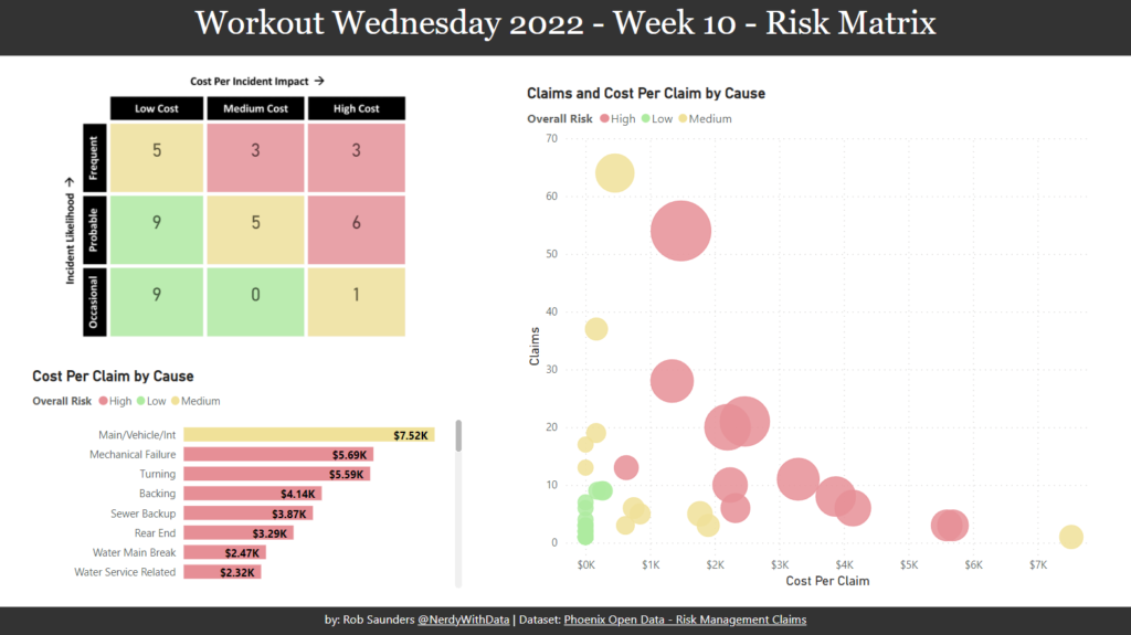
2022 Week 10 | Power BI: Risk Matrix

Introduction Your challenge this week is to create a Risk Matrix with some supporting visuals.  We decided to keep the project management theme going this week.  If you did not do last week’s challenge, I highly recommend you checkout Kerry’s Gantt Chart challenge, here.   For this challenge, I looked at a lot of possible ways to create a …

2022 Week 10 | Power BI: Risk Matrix Read More

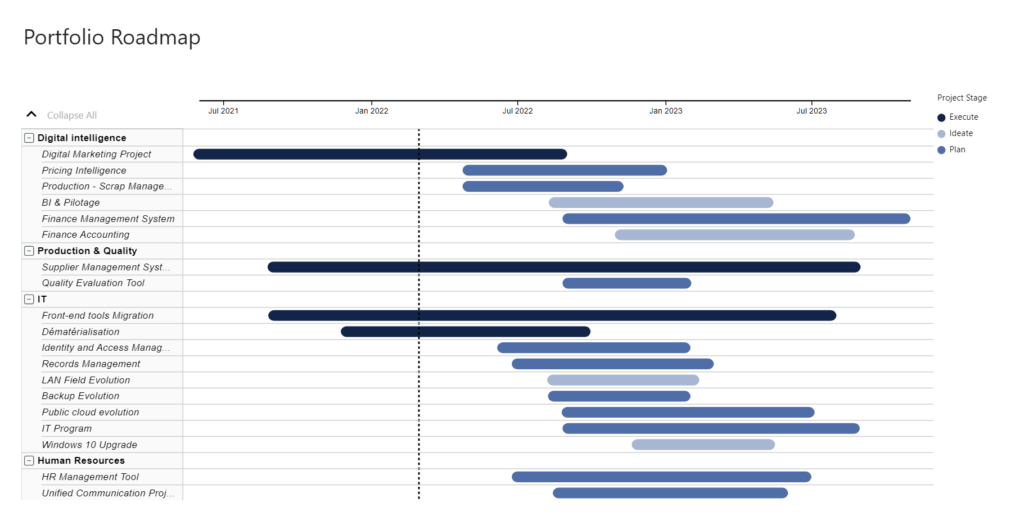
2022 Week 08 | Power BI: Can you make a Gantt Chart?

Introduction This week we are creating Gantt Charts in Power BI. It is not required to do all 4 variations, choose one of the options that interests you the most. Each option increases in time and/or experience level. Requirements QUICK MODE Import data Import the Microsoft Gantt Chart from AppSource Place Project Category in the …

2022 Week 08 | Power BI: Can you make a Gantt Chart? Read More

2022 Week 9: How many patients were admitted every 15 minutes?

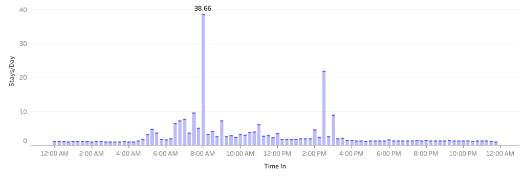
Introduction This week we are going to look at hospital admission rates. This data source comes from The Medical Stays dashboard on the Tableau Exchange. This particular challenge is more focused on working with time than it is working with medical data. In this challenge you need to group time into 15 minute increments throughout …

2022 Week 9: How many patients were admitted every 15 minutes? Read More

Scroll to Top