Year: 2023

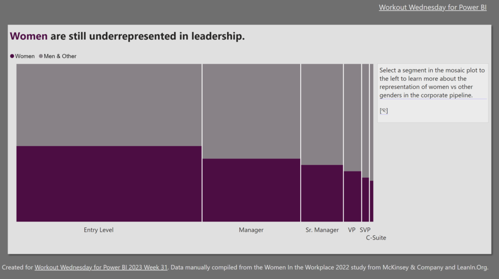
2023 Week 31 | Power BI: Create a Marimekko chart

Introduction Inspired by a Tableau Workout Wednesday from last year, we are going to make a Marimekko chart. A Marimekko chart, also known as a Mekko chart or mosaic plot, is used to visualize categorical data across two variables. Both axes use a percentage scale that determines the width or height of a bar. Think …

2023 Week 31 | Power BI: Create a Marimekko chart Read More

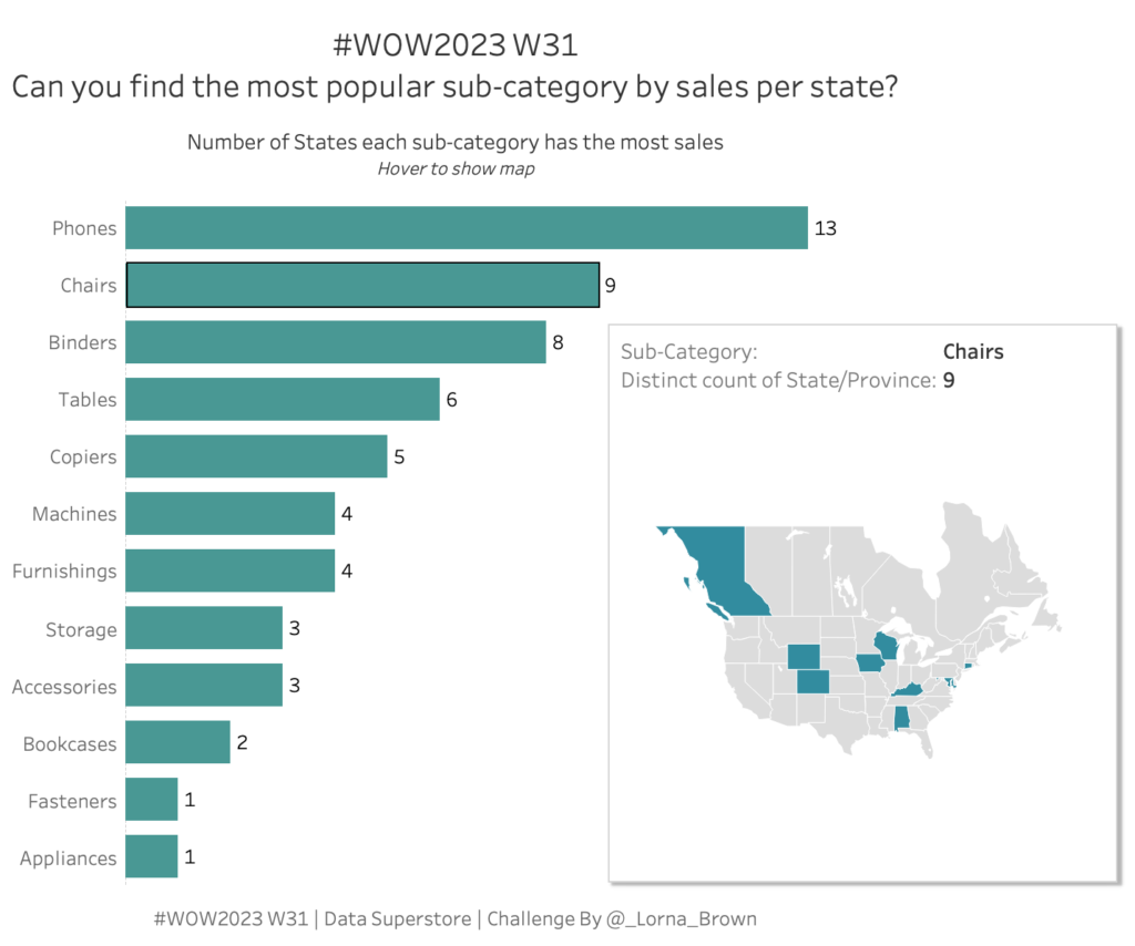
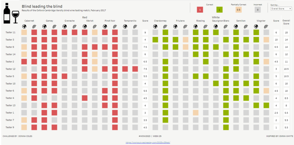
#WOW2023 W31: Can you find the most popular sub-category by sales per state?

Introduction I am a big fan of Level of Detail calculations and this one is an oldie but goodie! That is the main focus this week, but also uses Parameter Actions & Viz in Tooltips.  Click to open in Tableau Public Requirements Dashboard Size: 600 x 600 Two Sheets Find the most popular sub-category by …

#WOW2023 W31: Can you find the most popular sub-category by sales per state? Read More

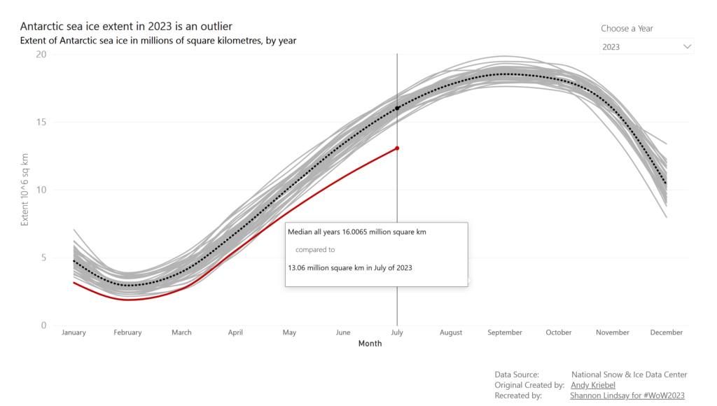
2023 Week 30 | Power BI: Build a smooth line chart

Introduction Welcome back to Workout Wednesday! This week we’re building a line chart using the new smoothing feature that was released this month! This week’s challenge was inspired by Andy Kreibel’s Makeover Monday challenge. We’re exploring the disappearing sea ice in the Antarctic using a line chart, looking at the extent of sea ice in millions of …

2023 Week 30 | Power BI: Build a smooth line chart Read More

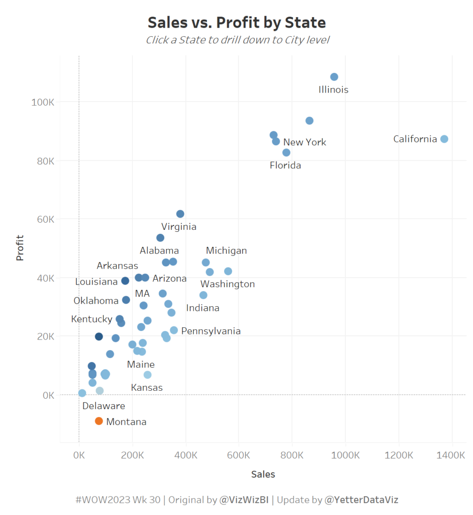
Scatterplot of profit on Y Axis and sales on X Axis, with a dot for each state, colored by profit ratio.

WOW2023 Week 30: Can you build a dynamic drill down scatterplot in one view?

Introduction We’re continuing retro month this week, and I decided to re-viz Andy’s Week 41 challenge from 2017. I chose this one because I really like the concept of being able to drill down from state into city on the same chart, but I wondered if things would be easier than the calculations required to …

WOW2023 Week 30: Can you build a dynamic drill down scatterplot in one view? Read More

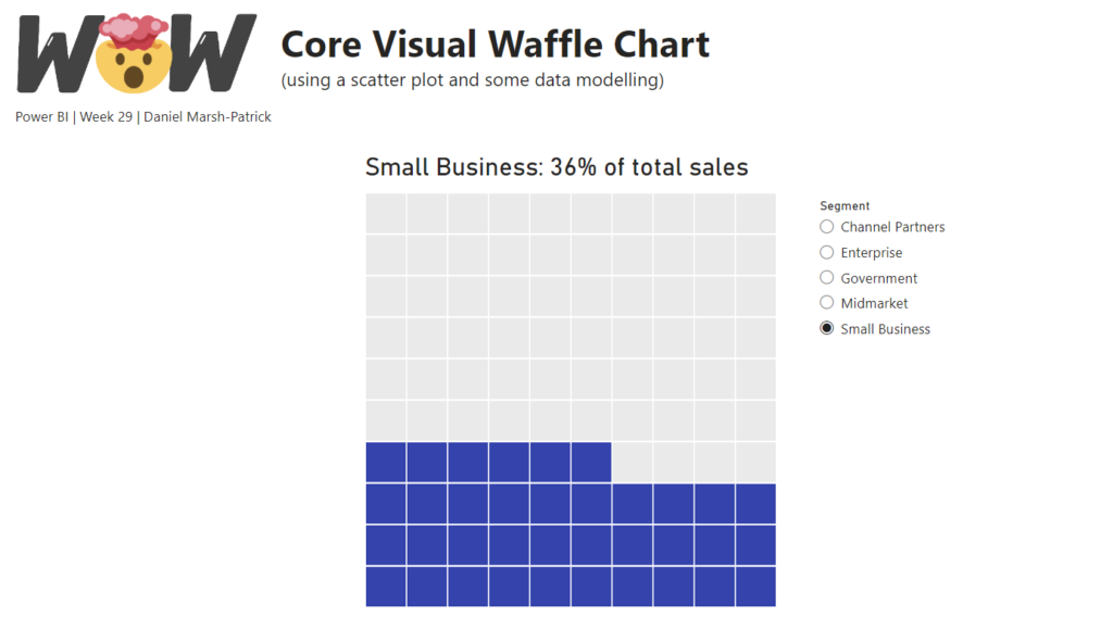
Waffle chart created with core visuals

2023 Week 29 | Power BI: Core Visual Waffle Chart

Introduction If you’re as old as I am, you might remember MacGyver. For eight-year-old me, he was simply the coolest person who ever lived: he was a brilliant thinker and could get out of any situation with a Swiss Army knife and whatever was lying around. These days, to “MacGyver something” is a homage to …

2023 Week 29 | Power BI: Core Visual Waffle Chart Read More

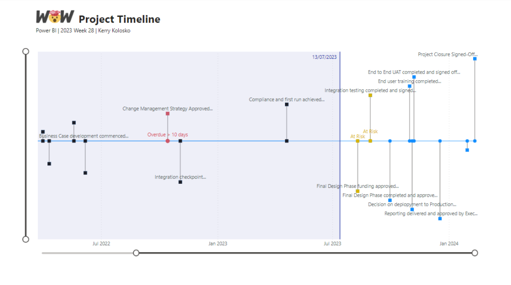
Project timeline Visual

2023 Week 28 | Power BI: Project Timeline

Introduction This week’s challenge was inspired by Bas. We are creating a Timeline Visual using the Line Chart and measure-driven data labels. For this project timeline, we will be adding a today line, highlighting completed milestones, and milestones that are off-track. We will be adding descriptors to the milestones and truncating the descriptors to a …

2023 Week 28 | Power BI: Project Timeline Read More

Scroll to Top