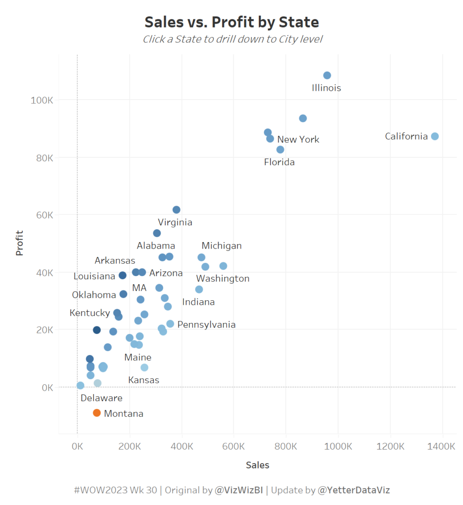
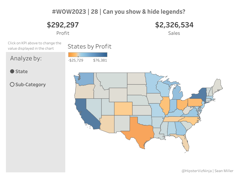
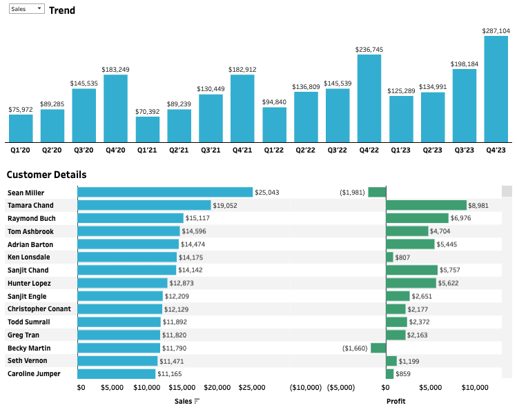
Workout Wednesday

2023 Week 27 | Power BI: Power Query Simple Pagination and a Treemap

Introduction This week we are going to have some fun with Power Query to obtain data from a website that spans multiple pages and then visualize the data in a treemap. Treemaps are meant to display hierarchical data as a set of nested rectangles. They aren’t a great replacement for bar charts when minor differences …

2023 Week 27 | Power BI: Power Query Simple Pagination and a Treemap Read More »

2023 Week 26 | Power BI: Display metrics with the new card visual

Introduction Welcome back to Workout Wednesday! This week we’re exploring the new card visual that was released in preview this month. Key metrics are frequently displayed in reports, and in the past it took a combination of cards, images, and other visuals. Thanks to the new card visual, we now have more flexibility, options for …

2023 Week 26 | Power BI: Display metrics with the new card visual Read More »

Bubble Chart Variants

2023 Week 25 | Power BI: Bubble Chart Variants with Charticulator

Introduction This week we are continuing our viz efforts inspired by the 1 dataset 100 visualizations project, presented by the Data Viz Project. Last week, Meagan challenged us to create as many visuals as possible using the Deneb custom visual available in Power BI AppSource. The week before, Shannon challenged us to make as many visuals as …

2023 Week 25 | Power BI: Bubble Chart Variants with Charticulator Read More »

#WOW2023 Week 25: Can you calculate a percent difference between a range of dates?

Introduction I saw this visualisation floating around my twitter and trending on Tableau Public and thought it would make a great challenge for Workout Wednesday. Big thanks to Jacob for letting me use his visualisation as inspiration today! In this weeks workout, I want you to look at the percent change between two dates, we …

#WOW2023 Week 25: Can you calculate a percent difference between a range of dates? Read More »

2023 Week 24 | Power BI: Visualize Change Between Two Points in Time with Deneb

Introduction This week we are continuing our viz efforts inspired by the 1 dataset 100 visualizations project, presented by the Data Viz Project. Last week, Shannon challenged us to create as many visuals as possible using the core visuals available in Power BI. This week’s challenge is to create visuals using the Deneb custom visual. I have …

2023 Week 24 | Power BI: Visualize Change Between Two Points in Time with Deneb Read More »

#WOW2023 Week 24 | Can you build a mobile KPI app?

Introduction This week’s challenge is another exploration of dynamic zone visibility, this time combined with a mobile app-like concept. Sometimes executives need just a few critical metrics at their fingertips, and this is a concept I’ve mulled around for a while (probably stemming from this concept by Anya A’Hearn) but felt like dynamic zone visibility …

#WOW2023 Week 24 | Can you build a mobile KPI app? Read More »

2023 Week 23 | Power BI: Build with Core Visuals

Introduction Welcome back to Workout Wednesday! This week’s inspiration comes from the incredibly cool 1 dataset 100 visualizations project, presented by the Data Viz Project. The basic premise of the 1 dataset 100 visualizations project is that the team created 100 visualizations using a single, simple dataset. In today’s exercise, we challenge you to re-create as many of …

2023 Week 23 | Power BI: Build with Core Visuals Read More »