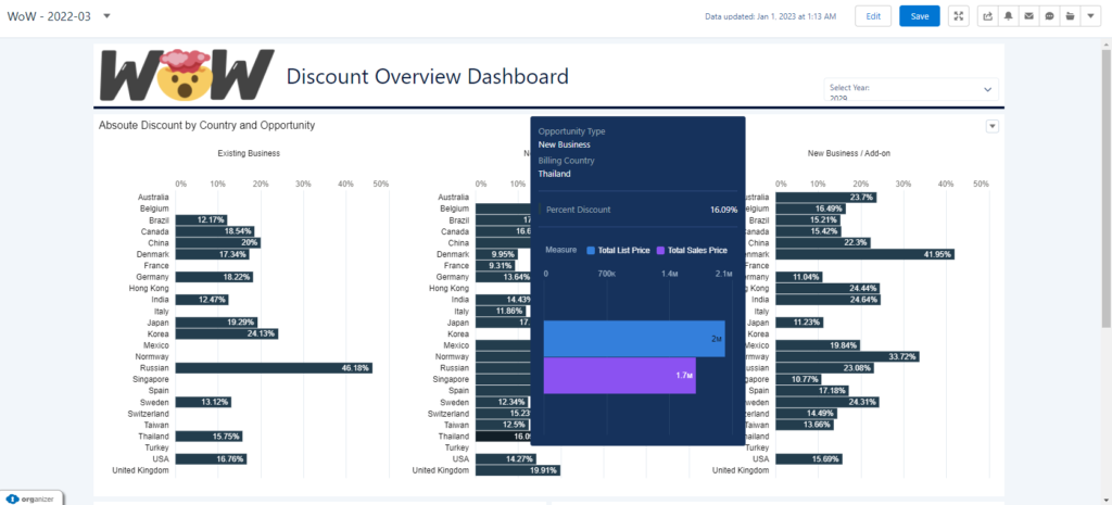
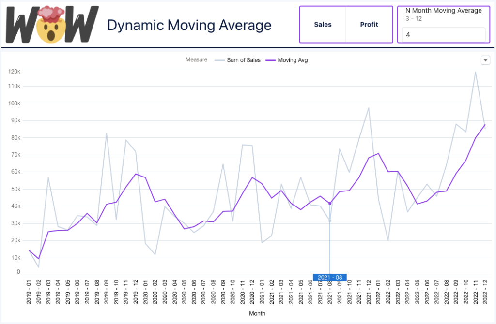
Month: January 2023

#WOW2023 | Week 5 | Can you build a funnel chart?

Introduction Hi everybody. It’s now my turn to set my first challenge as part of the official #WOW crew – eeek!. For those of you who don’t know me, I’ve been completing these challenges since the program was launched in 2017, and I blog solution guides on my personal blog at https://donnacoles.home.blog/. I’ve been approached …

#WOW2023 | Week 5 | Can you build a funnel chart? Read More

2023 Week 05 | Power BI: Visualize the Oscars with an Isotype/Pictogram Chart

Introduction Hello and welcome back to Workout Wednesday! If you’re joining us for the first time, be sure to check out our complete list of challenges. This week we’re looking at data from the American Academy Awards, also known as the Oscars. The Oscars are awards for artistic and technical merit for the American film industry …

2023 Week 05 | Power BI: Visualize the Oscars with an Isotype/Pictogram Chart Read More

2023 Week 04 | Power BI: Mortgage Rates Area Chart

Introduction Hello everyone! I’m excited to have my first challenge of 2023 up and ready for your enjoyment. Last year I got a reputation as providing challenges that were, let’s say….a little on the easier side, so this year I’m just going to own it!  I was scrolling Twitter in hopes of finding some inspiration …

2023 Week 04 | Power BI: Mortgage Rates Area Chart Read More

2023 Week 04 | Interactions & Custom Queries

Introduction This week we are going to continue working on our dashboard from last week. We will add some new functionality with interactions and custom queries.  Requirements Create a custom query using the dimensions from the dataset you produced in challenge 1. Use the following fields: Product Family, Type and Billing Country.  Add a Toggle Widget …

2023 Week 04 | Interactions & Custom Queries Read More

Vertical Area Chart describing Republican and Democrat shifts in ideology

2023 Week 03 | Power BI: Vertical Area Chart

Introduction Howdy All! We’re all topsy-turvey this week turning line charts on their side! ⇩ This weeks challenge was inspired by Nick Desbarats article Are Vertical Line Charts Ever a Good Idea? Can you find some other examples where vertical line charts may be a good idea? ⋟^◕ܫ◕^⋞ Happy Vizzing Requirements Power Query Obtain the voteview_polarization_data.csv …

2023 Week 03 | Power BI: Vertical Area Chart Read More

2023 Week 03 | Interactive Discount Dashboard

Introduction This week we will continue working on our dashboard from last week. We’ll improve the design a little bit and work on the interactivity to provide more information and guide the user through the dashboard. Requirements Make the header a solid white box with a a solid line below (same colour as the first …

2023 Week 03 | Interactive Discount Dashboard Read More

#WOW2023 | Week 3 | Calculating Year-On-Year Percentage Change

Introduction This week’s challenge is one I’ve been waiting to share with you. It has a bit of everything, so I hope you enjoy it! The goal is to visualize the Sales in a given year for different countries in Europe, with an indicator in the tooltip to identify whether this value has increased or …

#WOW2023 | Week 3 | Calculating Year-On-Year Percentage Change Read More

Area charts with layered series

2023 Week 02 | Power BI: Create layered line/area charts with labels and annotations

Introduction For our second week of Workout Wednesday 2023 Power BI Edition, we are taking inspiration from a recent Washington Post interactive story titled “See just how bad a year it was for your retirement account — and why”. The article looks at the closing price of the S&P 500, comparing the value at the …

2023 Week 02 | Power BI: Create layered line/area charts with labels and annotations Read More

Scroll to Top