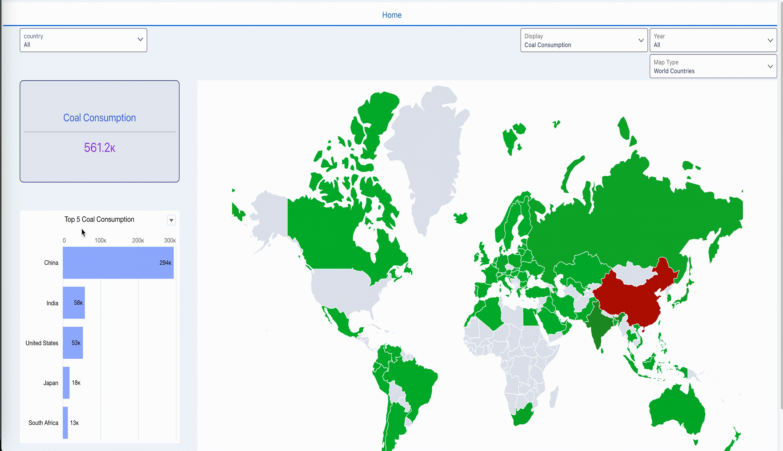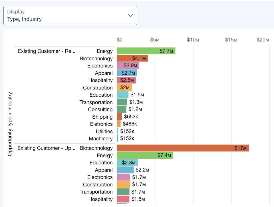
2024 Week 9 | Sigma: Can you create Bar charts in this Pivot Table?
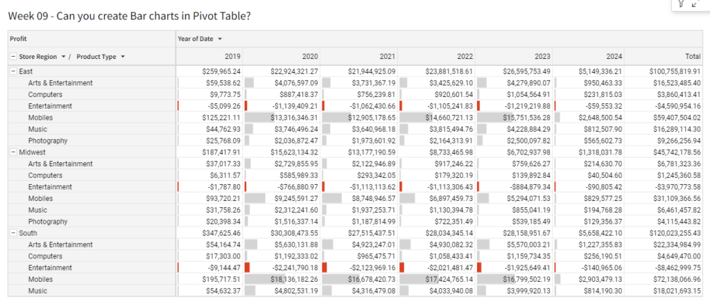
Introduction This week have a guest author! Tausif Kazi is an expert in data visualization who is experienced in several platforms such as Sigma, Power BI, Tableau, and Snowflake. Connect with Tausif:Linkedin: https://www.linkedin.com/in/tausifkazi/Twitter: https://twitter.com/VizByTK This challenge will cover how to create a Bar chart in Pivot Tables. This will help your users quickly understand the …
2024 Week 9 | Sigma: Can you create Bar charts in this Pivot Table? Read More