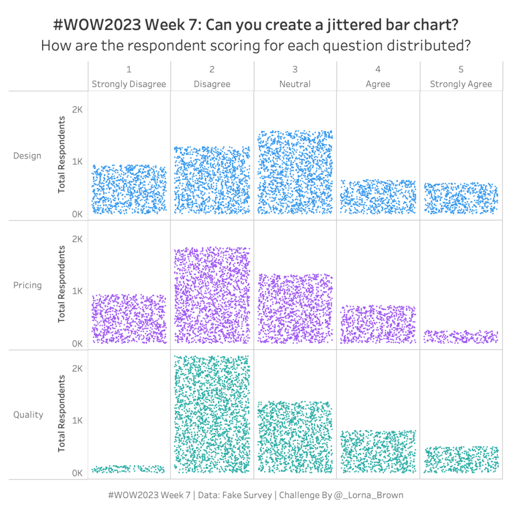
#WOW2023 Week 7: Can you create a Jittered Bar Chart?
NPS Survey data can be tricky to wrangle and work with. Check out this week’s Tableau #WorkoutWednesday and see if you can do it!
Introduction As Donna mentioned last week, this month we’re focusing on alternative chart types. This jitterplot is a fun one inspired by one of Steve Wexler‘s charts in The Big Book of Dashboards. I like jitterplots because they allow you to easily see how an individual compares to the rest of the group via distribution, …
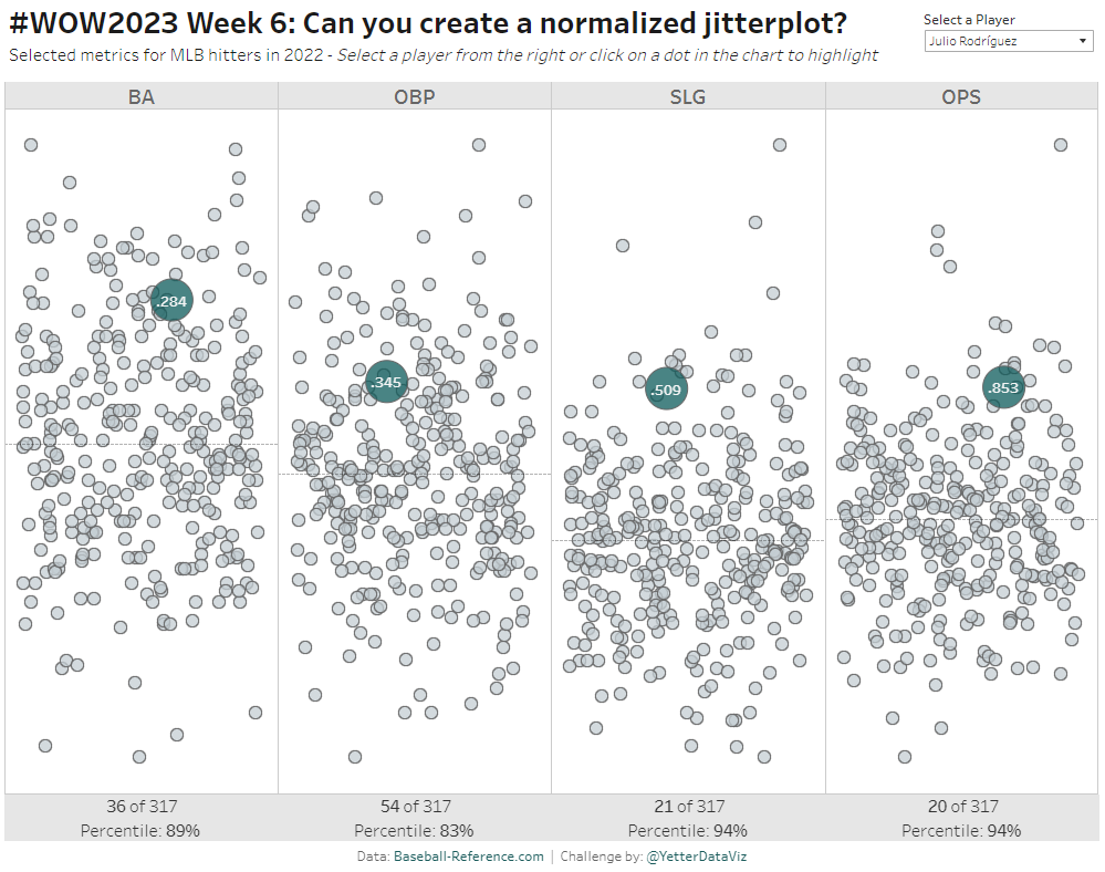
#WOW2023 | Week 6 | Can you create a normalized jitterplot? Read More
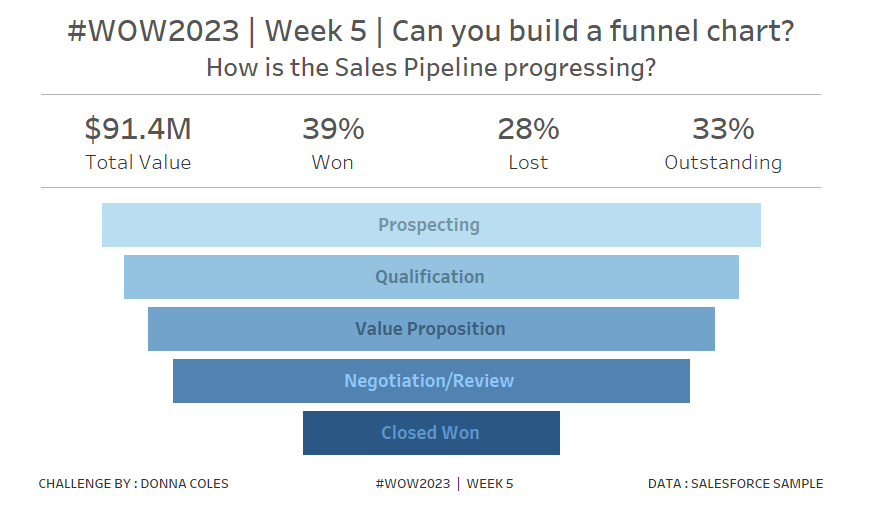
Introduction Hi everybody. It’s now my turn to set my first challenge as part of the official #WOW crew – eeek!. For those of you who don’t know me, I’ve been completing these challenges since the program was launched in 2017, and I blog solution guides on my personal blog at https://donnacoles.home.blog/. I’ve been approached …
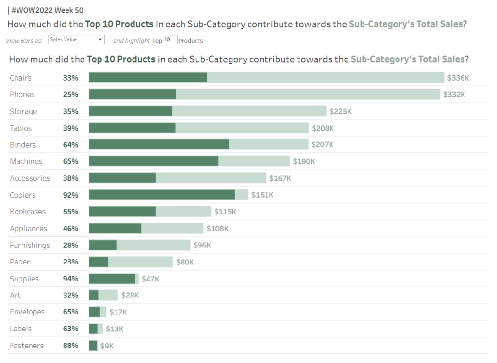
Introduction This is my last challenge of the year and what better way to round things off than with everyone’s favourite chart – the bar chart – but let’s make it “sexy”. Bar charts may be simple but when you combine them with some interactive highlighting and sorting you can create something quite dynamic which …
#WOW2022 | Week 50 | Interactive Proportional Brushing Read More
Introduction This is probably my favorite challenge of the year. So i’m saving it for near the end. You’ll need level-of-detail and table calculations to solve this one. For this challenge you need to calculate customer lifeftime value (in sales). While their are many ways to do this. We are going to keep this as …
2022 – WEEK 44: What is the lifetime value of customers? Read More
Watch Introduction Hi Workout Wednesday friends! I’m back, just in time for the Tableau 2022.3 release, which means we’ll be exploring Dynamic Zone Visibility. This new feature allows you to use calculations and logic to dynamically show and hide dashboard elements (pretty powerful). So in this challenge, you’ll get some hands on exposure to this …
#WOW2022 | Week 43 | Selected Subcategory Influence Read More
Introduction Hello there, Workout Wednesday #DataFam! This week’s challenge is all about two of my passions growing up: baseball and physics. This past baseball season, New York Yankees outfielder Aaron Judge broke the 61 year old American League record for home runs in a single season set by Roger Maris in 1961 – Judge concluded …
#WOW2022 | Week 42 | Can you use Tableau to estimate Aaron Judge’s home run trajectories? Read More
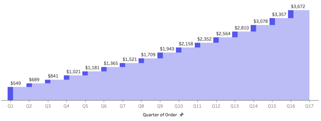
Introduction This week is Dreamforce; Salesforce’s conference. So I thought I would stay on theme and use Salesforce Data. When I first started to see Salesforce pre-built dashboards they included several elements, but the one we are going to focus on today is the Waterfall chart. This allows us to see how much value is …
#WOW2022 W38: Can you create a Waterfall Pipeline using Salesforce Data? Read More
Every needed to visualize a % of total across two dimensions & measures? Then the Marrimeko chart is what you need! Check out this week’s #WOW2022 challenge for a throwback to 2017 week 8
Introduction This week we return to another business-specific challenge. This team we will explore hospitality data. The goal of this challenge is to determine what the average occupancy is by day at three different properties. The challenge of this data is that you’ll only ever know when customers check-in or check-out. Not the actual total …
2022 – Week 34: What is the average occupancy by weekday? Read More