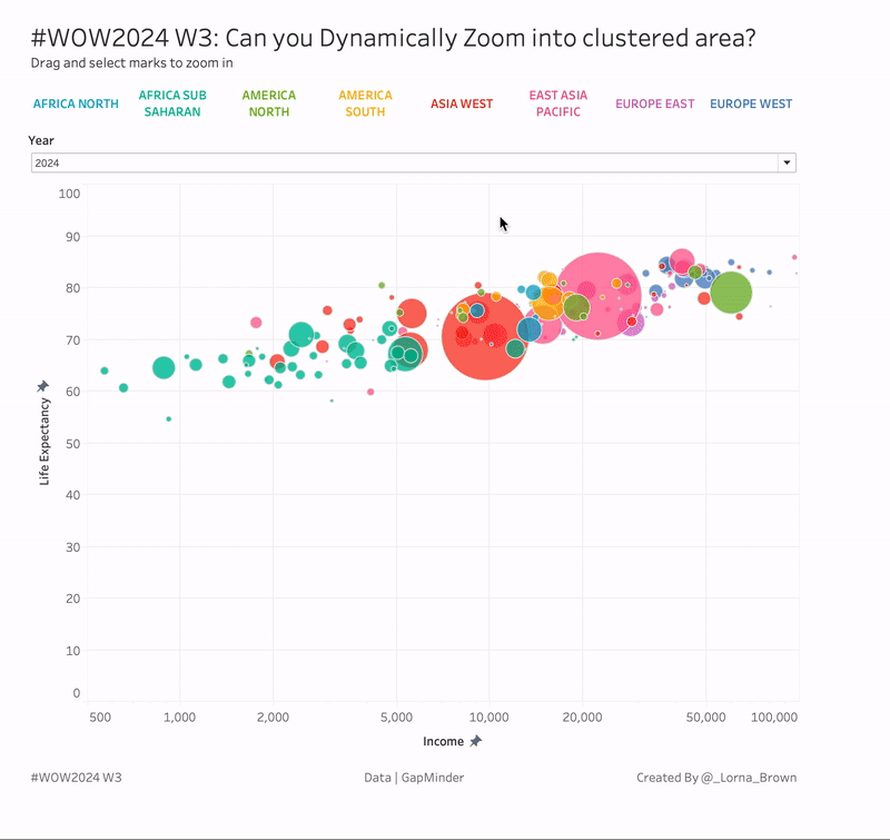
Project timeline Visual

2023 Week 28 | Power BI: Project Timeline

Introduction This week’s challenge was inspired by Bas. We are creating a Timeline Visual using the Line Chart and measure-driven data labels. For this project timeline, we will be adding a today line, highlighting completed milestones, and milestones that are off-track. We will be adding descriptors to the milestones and truncating the descriptors to a …

2023 Week 28 | Power BI: Project Timeline Read More

2023 Week 27 | Power BI: Power Query Simple Pagination and a Treemap

Introduction This week we are going to have some fun with Power Query to obtain data from a website that spans multiple pages and then visualize the data in a treemap. Treemaps are meant to display hierarchical data as a set of nested rectangles. They aren’t a great replacement for bar charts when minor differences …

2023 Week 27 | Power BI: Power Query Simple Pagination and a Treemap Read More

2023 Week 26 | Power BI: Display metrics with the new card visual

Introduction Welcome back to Workout Wednesday! This week we’re exploring the new card visual that was released in preview this month. Key metrics are frequently displayed in reports, and in the past it took a combination of cards, images, and other visuals. Thanks to the new card visual, we now have more flexibility, options for …

2023 Week 26 | Power BI: Display metrics with the new card visual Read More

2023 Week 26 | The Component Widget

Introduction This week we are exploring the Component widget. Essentially it is a container with pages that allows you to quickly create and reuse dynamic areas of a dashboard! Components solve 2 main use cases: Reusability & maintainability (the components you create in this challenge will be used again in a future challenge!) Easily (through …

2023 Week 26 | The Component Widget Read More

Bubble Chart Variants

2023 Week 25 | Power BI: Bubble Chart Variants with Charticulator

Introduction This week we are continuing our viz efforts inspired by the 1 dataset 100 visualizations project, presented by the Data Viz Project. Last week, Meagan challenged us to create as many visuals as possible using the Deneb custom visual available in Power BI AppSource. The week before, Shannon challenged us to make as many visuals as …

2023 Week 25 | Power BI: Bubble Chart Variants with Charticulator Read More

Scroll to Top