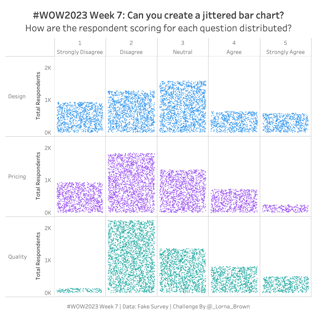
#WOW2023 Week 7: Can you create a Jittered Bar Chart?
NPS Survey data can be tricky to wrangle and work with. Check out this week’s Tableau #WorkoutWednesday and see if you can do it!
NPS Survey data can be tricky to wrangle and work with. Check out this week’s Tableau #WorkoutWednesday and see if you can do it!
Introduction This week we have a lot going on! I originally found a hack about 2 years ago how to create a timeline stacked bar chart. I don’t know if I just didn’t find the easy way to do it or if they released a new feature since then. Anyway, this is what we’ll do …
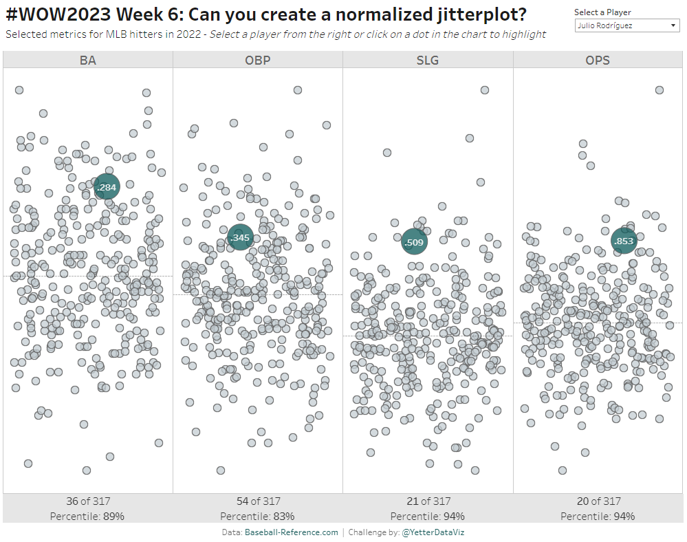
Introduction As Donna mentioned last week, this month we’re focusing on alternative chart types. This jitterplot is a fun one inspired by one of Steve Wexler‘s charts in The Big Book of Dashboards. I like jitterplots because they allow you to easily see how an individual compares to the rest of the group via distribution, …
#WOW2023 | Week 6 | Can you create a normalized jitterplot? Read More »
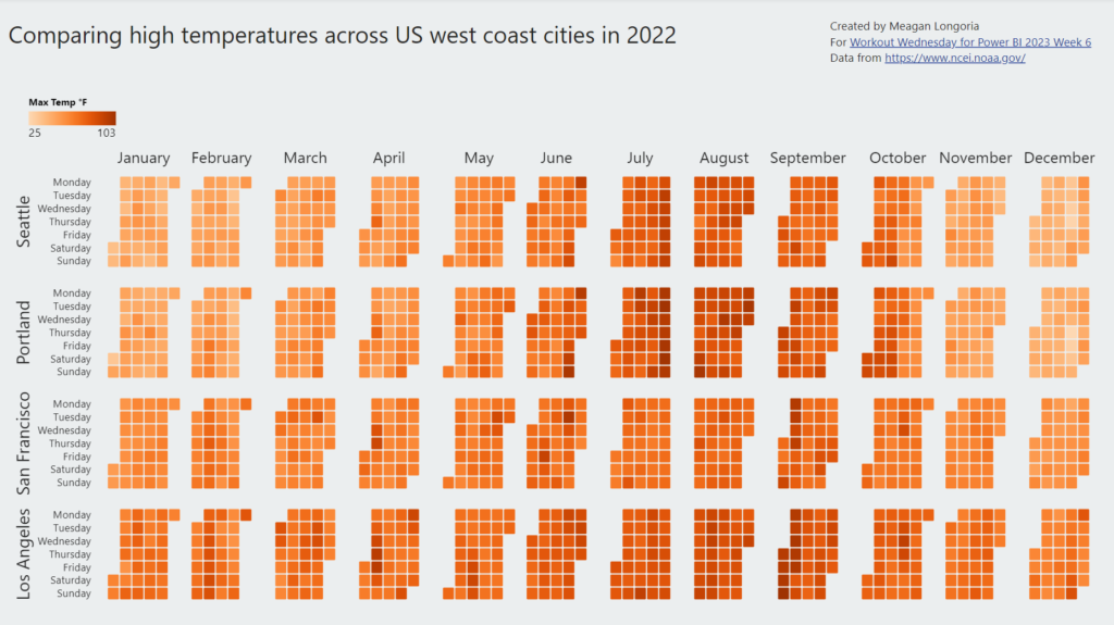
Introduction For this week’s challenge, we are creating a calendar heatmap. There is no default visual for this, and many of the custom visuals are not very flexible, but Deneb has us covered. Requirements Create a calendar visual: Show day of the week on rows and week on columns. (Hint: If you get stuck on …
2023 Week 06 | Power BI: Create a Calendar Heatmap Read More »
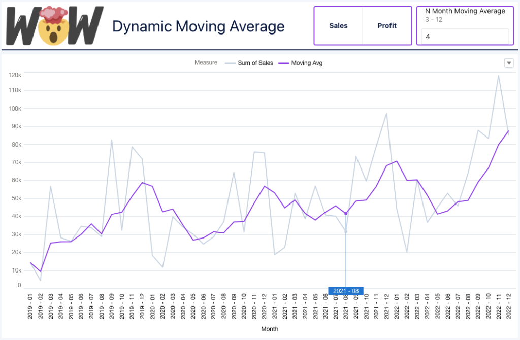
Introduction Using a moving average is a great technique to smooth out fluctuations in data points and help us see the overall trend of a particular metric. We could create a visualization that fixes the moving average to a particular number of months, but we could bring greater value to the user by allowing them …

Introduction Hi everybody. It’s now my turn to set my first challenge as part of the official #WOW crew – eeek!. For those of you who don’t know me, I’ve been completing these challenges since the program was launched in 2017, and I blog solution guides on my personal blog at https://donnacoles.home.blog/. I’ve been approached …
#WOW2023 | Week 5 | Can you build a funnel chart? Read More »

Introduction Hello and welcome back to Workout Wednesday! If you’re joining us for the first time, be sure to check out our complete list of challenges. This week we’re looking at data from the American Academy Awards, also known as the Oscars. The Oscars are awards for artistic and technical merit for the American film industry …
2023 Week 05 | Power BI: Visualize the Oscars with an Isotype/Pictogram Chart Read More »
NPS Survey data can be tricky to wrangle and work with. Check out this week’s Tableau #WorkoutWednesday and see if you can do it!
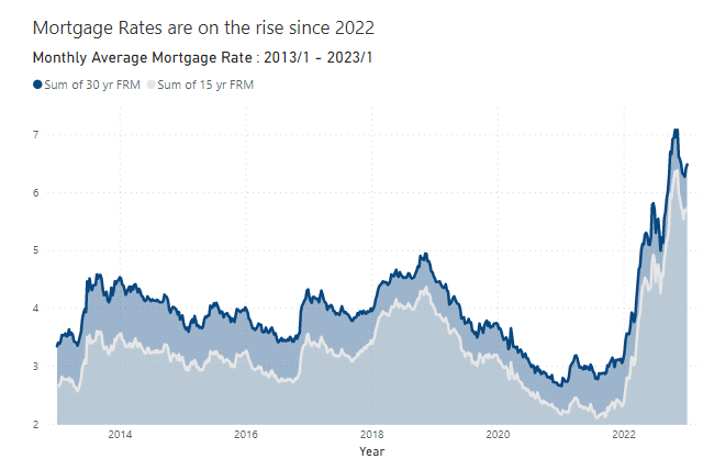
Introduction Hello everyone! I’m excited to have my first challenge of 2023 up and ready for your enjoyment. Last year I got a reputation as providing challenges that were, let’s say….a little on the easier side, so this year I’m just going to own it! I was scrolling Twitter in hopes of finding some inspiration …
2023 Week 04 | Power BI: Mortgage Rates Area Chart Read More »
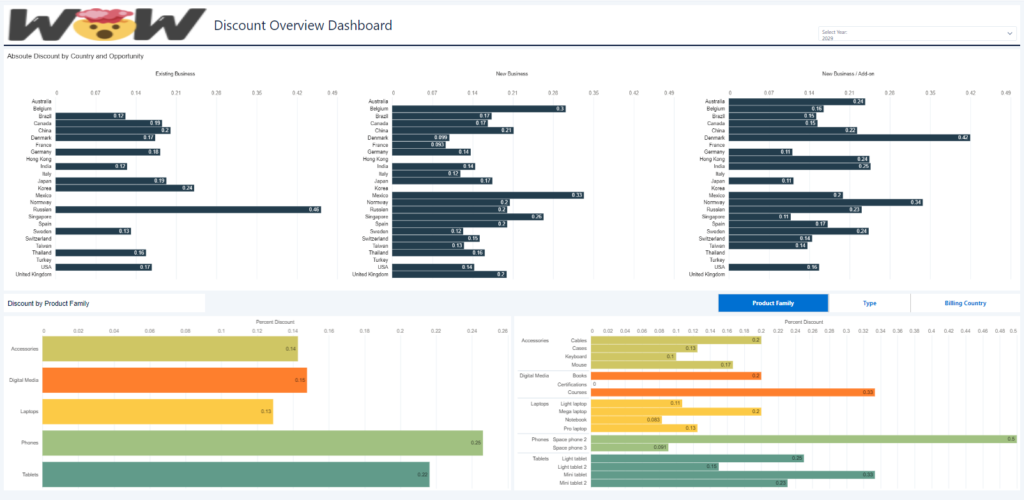
Introduction This week we are going to continue working on our dashboard from last week. We will add some new functionality with interactions and custom queries. Requirements Create a custom query using the dimensions from the dataset you produced in challenge 1. Use the following fields: Product Family, Type and Billing Country. Add a Toggle Widget …